Showing posts with label Printed Bee. Show all posts

Tuesday, September 01, 2015

The Printed Fabric Bee: Architecture

Hey! It's my turn to be the "queen bee" in the Printed Fabric Bee. That just means I picked the theme, size and color palette. Plus, I'll be coordinating the give-away of a collection of 6x6 inch printed fabrics.

I chose Architecture. Each of the other members of The Printed Fabric Bee will be sending me a 12x12 inch piece of original fabric with this theme using the color blue... any blues at all.

Since I recently visited a Frank Lloyd Wright house in NY, I chose his iconic Tree of Life window as my inspiration. I decided to do a faux batik technique using Elmer's Gel Glue. Here are my supplies.

I sketched the lines using a air-disappearing pen. (This piece ended up with too much detail, I had make it more simple.)

Here's you can see the wet glue and the partially disappearing lines.

Here is the 12x12 square after it dried over night.

I used watered down acrylic paint to add the color. It was important to mix the paint and water really well. I wanted a pretty smooth color coverage, no specks or blobs.

Here I've begun filling in the spaces and the paint stayed within the glue lines quite well.

Even though I picked "blues" as my palette, that just really didn't make sense for this design. I had to add something else!


Here is the 6x6 square (for the give-away) and the 12x12 square after the painting was complete. I let the paint dry overnight.

The next day, I filled a bucket with water...

and spent some time swishing and soaking.

There are some other fabrics in the bucket with the Wright windows. You'll see those next month. Hint.

Each fabric really had to be rubbed and massaged so all the glue was off of the fabric. Then I set the pieces on a towel to dry before ironing.

I am thrilled with the results! Here is the 6x6 square.
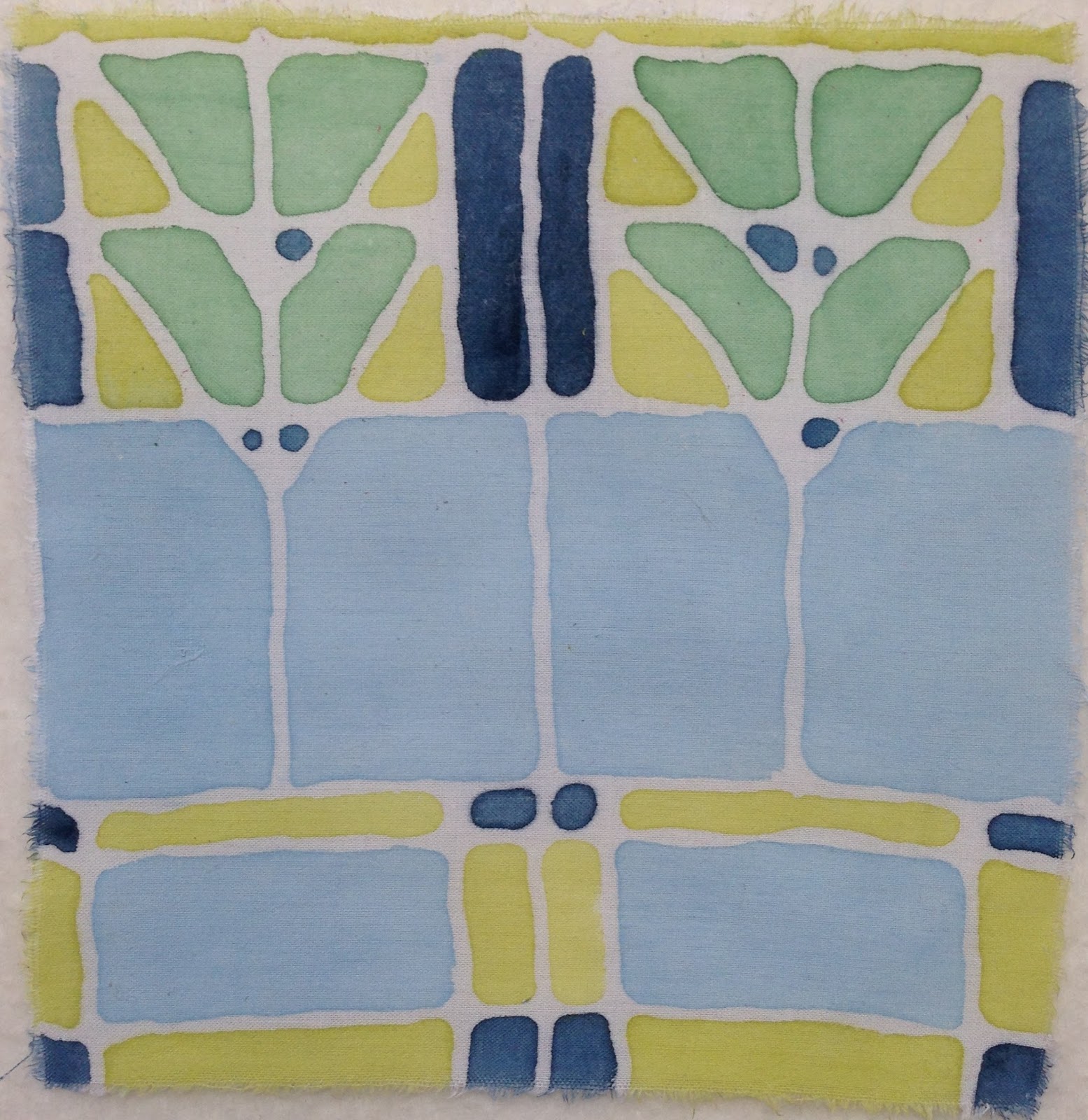
And here is the 12x12 square.

A detail. Those glue lines came out surprisingly crisp.

Obviously, you can't get super straight edges or pointy corners, but that's not what I was going for.

Would you like to win the collection of 6x6 pieces? Go to The Printed Fabric Bee blog and leave a comment. All the commenters will be entered in a drawing for the collection on September 15.

As usual, here are my thoughts about what worked and what didn't work this month.

Successful:

  • It's just a great technique. The masking worked great. It was easy to apply. The glue is cheap and easily available.
  • The air disappearing ink was just the right tool, too.
  • Carefully mixing the paint worked well. I'm very pleased with the smooth coverage. The colors are surprisingly deep. I expected more fade and wash out.
  • I'm pleased with the design... even though it's not really my own. But it's fun to do work clearly inspired by other artists.
  • Color palette works. I especially like the light blue, which really does kinda look like the clear glass that was in some of the sections of Wright's windows.
Less Than Successful:
  • My hand was so sore after applying all that glue! (I did more than just the ones I've shown here.)
  • This technique lends itself to more flowy paint and combining colors, which wasn't appropriate here, but is a bit of a missed opportunity. 
  • The dark blue was a bit too dark in some areas. Not a big deal.
  • If we want to get technical, this isn't really a "print" which is the idea behind The Printed Fabric Bee. 
  • Also The Printed Fabric Bee theoretically requires two layers of printing. There is really only one layer of design here. 
Check out the other artists' architecture pieces on The Printed Fabric Bee blog! And comment to be entered in the give-away.

Saturday, August 01, 2015

Printed Fabric Bee Reveal: Insects!

Jane Davila was the "queen bee" this month. She chose insects as her theme. Her color palette request was "artist's choice" with a touch of black. 

I printed fabric for this theme at the printing making workshop I attended in May. 

I began with this sketch. 

I used the printing technique known as "drypoint." I placed a sheet of plexi over my drawing and used a metal tool to scratch the design into the plexi.

Then I used this rolled up paper towel to work the ink into the grooves.

Then I wiped off the paint from the surface.

I put the fabric on top of the plexi and ran it through the table top press we had for the workshop. Ta Da! This is the 6x6 inch piece of fabric which will be included in our monthly Printed Bee give-away.

This is a pretty decent detail. I like the lines I added to the wings. That added some much needed depth or at least a darker area.

Jane requested a 12x12 piece of fabric. I was able to print my plate four times on this piece of fabric.

I was excited when I found this piece of hand dyed fabric in my stash. I had the 12x12 piece and an additional piece that could be used for the 6x6. It made me think of the amazingly bright colors sometimes seen on beetles or the irredescent wings of a dragonfly.

But, I think the fabric fights with the image. The drypoint lines are just too thin and subtle to compete with the mottled fabric is strong orange and purple.

As I do with all my process posts for The Printed Fabric Bee, here's what I thought was successful and less than successful.

Successful:
  • The grid design with the four different insect sketches.
  • The striped areas of the fly's wings, ant's body and beetle's head.
  • Brightly colored fabric.
  • Trying something new!

Less Than Successful:
  • Images are too faint and weak.
  • The butterfly really doesn't match the other insects. He lacks finesse of any kind.
  • I wasn't able to get very precise lines with the drypoint technique. It feels jagged and lacks control.
  • Edges of the plate made severe creases in the fabric.
Remember, you can win a collection of all the insect fabrics from the artists of The Printed Fabric Bee. Comment on Jane's blog or on the Printed Fabric Bee blog. Jane will draw on winner on August 15.

Saturday, July 04, 2015

Printed Fabric Bee Reveal! Vintage!

Time for another reveal for The Printed Fabric Bee. Lynn Krawcyzk chose "vintage" as her theme. I decided to explore the idea of vintage bottles.

I started with an image of bottles and cut out the shapes.


Then traced them on sticky-back fun foam.

Then cut them out.

Then stuck them to pieces of styrofoam from a recycled meat tray.

I chose blue, teal and gray paints thinking that might suggest vintage bottles.

I did a test print here. I like the idea that the bottles are translucent. You can see through them as if they are sitting on a window sill.

I printed an 8x18 piece to send to Lynn (that's her requested size), the 6x6 for our monthly give-away and another piece to keep in my stash and for my records. 

After printing the bottles, I wanted to add another layer of design. (Plus the "rules" of the Printed Fabric Bee require at least two printed layers.) So, I used my splatter brush to add a bit of black. It gave it a bit of depth.

You may remember that I when I created fabric for our petroglyphs theme, I wished I had a splatter brush. I've since purchased one! Definitely a nice additional to my box of painting tools.

It still needed something, so I drew this tiny little stem with tiny little leaves in a few of the bottles.

Here is the finished 6x6.

Here is Lynn's piece. It's like three shelves in a decorative medicine cabinet.


As usual, I like to review what worked and what didn't work with my fabrics for The Printed Fabric Bee.

Successful:

  • The shape of the bottles and the subtle difference between them.
  • Sticky back fun foam stamps are so fast and easy!
  • I love the layers of paint where the bottles overlap.
  • The paint application is a bit inconsistent which sort of makes it look like light reflecting on the bottles.
  • The splatter adds depth.
  • The line drawn stem is sweet.


Less Than Successful:

  • The shapes of the bottle don't fill up the 6x6 size too well. In fact, I'm not sure I love the arrangement of bottles on the larger piece of fabric either. 
  • Paint might have been applied more smoothly with a brayer.
  • The color palette isn't too sophisticated and doesn't really read as vintage. I should I have mixed a light, medium and dark cobalt.
  • The line drawn stem is a little too sweet.
Check out all the interpretations of "vintage!" Find links to all the artists on The Printed Fabric Bee blog. Plus, you can leave a comment on Lynn's blog for a chance to win the collection of 6x6 fabrics. Comment before July 10. 

Monday, June 01, 2015

The Printed Fabric Bee: Found Objects!

Leslie Tucker Jenison chose "found objects" as the theme for The Printed Fabric Bee this month. She also requested a neutral color palette with a pop of color. Ok... challenge accepted.

I created my fabric for this month's theme while in a three day print making workshop. I gathered a bunch of random objects and brought them to the workshop with me. I used plain white muslin and black paint.

First layer... pastry blender.
You can see that I've got a layer of black felt under the cloth. That allows the objects to sink into the cloth a little to get a better print.

Next layer: tiny toy turtle.

If you zoom into this picture, you may be able to see the tiny imprint of "China" on these stamps.

Is this a triangle cookie cutter? I'm not sure. You can see I'm working on a large piece of fabric that will go to Leslie and a 6x6 inch piece that will be included in our monthly give-away.

I'm not sure where this came from. But it's awesome! A square filled with tiny circles. 

As the last layer, I add tiny pairs of teal circles. This is a very subtle "pop of color."

You can see that I also filled in the fabric somewhat randomly and left some areas unprinted. I really like the movement of the shapes across the fabric. It would look entirely different if I'd filled the whole piece of cloth.

I think the pastry blender is my favorite!

Here is the 6x6 inch fabric. Comment on The Printed Fabric Bee blog for a chance to win the whole collection.

As usual, I like to review what worked and what didn't work for my submissions for The Printed Fabric Bee.

Successful:

  • I loved the random/not random placement of the prints across the fabric. I generally default to a grid pattern and this was a good departure.
  • I like the mix of open shapes with filled shapes.
  • I really like working with just black and white.
  • Creating the fabric within a workshop setting was nice also. It's good to get out of my own studio every now and then.
  • Using a layer of felt under the fabric was really important. (I learned this from Julie Booth's book.)


Less Than Successful:

  • We were using Akua printing ink for the whole workshop. I'm not sure I love it on fabric. It takes a super long time to really really dry. (Days!) It's probably fine, but it wouldn't be my first choice for this kind of work in the future.
  • I wish I would have chosen a much bolder pop of color.
  • Honestly, I like that pastry blender print so much, I almost wish I'd used just that. 

Be sure to check out how the other members of The Printed Fabric Bee interpreted this challenge on our blog and Facebook page.

Sunday, May 03, 2015

The Printed Fabric Bee: Geometric Forms

Time for another reveal with The Printed Fabric Bee. This time Gerrie Congdon chose "geometric forms" as our theme. She left the color palette up to the artist. 

After scrolling through ideas and possible bits of inspiration on Pinterest, I settled on the idea of over lapping shapes. I printed this inspiration image and four shapes that I could cut out to make stencils.

Here you can see I've cut out the shapes and begun tracing them onto some yellow fabric.

You may also be able to see the registration dots that I measured out on the fabric before tracing the shapes. I wanted them to be aligned at regular intervals, so the dots provided a good guide.

This is the 12x12 inch piece that I've sent off to Gerrie. I wanted the shapes to fill up the space in a somewhat irregular pattern. Aligned, but filling different areas of the space.

Then I used watered down acrylic paint to fill in some of the spaces created by the shapes and the overlapping areas.
You can see the 12x12 piece in the foreground here and the 6x6 that will be a part of our monthly give-away on the other side of the table.

I wanted the paint to bleed over the shapes and into the other colors just like this! (I used this same idea for my Old World Maps theme.)

For one additional layer of detail, I stamped numbers in each shape. The numbers correspond to the number of sides for each shape. Does a circle have one "side?" I wasn't sure, so I left it blank.

When I joined The Printed Fabric Bee, I decided I'd make notes each month about what worked and what didn't work with my process for each theme.

Successful:
  • Printing the shape on card stock, cutting it out and tracing it using the Pigma pen was simple and effective. Lots of potential for future uses.
  • I really like the overlapping and the shapes created by the overlaps and adding paint to some of those areas... but not all.
  • I also like the watered down paint and the bleeding combined with the black lines.

Less Than Successful:
  • This color palette is pretty uninspired.
  • A less random configuration of shapes might have been more interesting. (Something more like the inspiration image which you can see printed on the paper with the stencil shapes.)
  • I might like the whole thing better without any color... just the outlines.
Leave a comment on Gerrie's blog and/or The Printed Fabric Bee blog to win a collection of "geometric forms" fabric from all the member of The Printed Fabric Bee.