Time for another reveal for The Printed Fabric Bee. Lynn Krawcyzk chose "vintage" as her theme. I decided to explore the idea of vintage bottles.
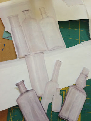
I started with an image of bottles and cut out the shapes.
Then traced them on sticky-back fun foam.
Then cut them out.
Then stuck them to pieces of styrofoam from a recycled meat tray.
I chose blue, teal and gray paints thinking that might suggest vintage bottles.
I did a test print here. I like the idea that the bottles are translucent. You can see through them as if they are sitting on a window sill.
I printed an 8x18 piece to send to Lynn (that's her requested size), the 6x6 for our monthly give-away and another piece to keep in my stash and for my records.
After printing the bottles, I wanted to add another layer of design. (Plus the "rules" of the Printed Fabric Bee require at least two printed layers.) So, I used my splatter brush to add a bit of black. It gave it a bit of depth.
You may remember that I when I created fabric for our petroglyphs theme, I wished I had a splatter brush. I've since purchased one! Definitely a nice additional to my box of painting tools.
It still needed something, so I drew this tiny little stem with tiny little leaves in a few of the bottles.
Here is the finished 6x6.
Here is Lynn's piece. It's like three shelves in a decorative medicine cabinet.
Successful:
- The shape of the bottles and the subtle difference between them.
- Sticky back fun foam stamps are so fast and easy!
- I love the layers of paint where the bottles overlap.
- The paint application is a bit inconsistent which sort of makes it look like light reflecting on the bottles.
- The splatter adds depth.
- The line drawn stem is sweet.
Less Than Successful:
- The shapes of the bottle don't fill up the 6x6 size too well. In fact, I'm not sure I love the arrangement of bottles on the larger piece of fabric either.
- Paint might have been applied more smoothly with a brayer.
- The color palette isn't too sophisticated and doesn't really read as vintage. I should I have mixed a light, medium and dark cobalt.
- The line drawn stem is a little too sweet.
Check out all the interpretations of "vintage!" Find links to all the artists on The Printed Fabric Bee blog. Plus, you can leave a comment on Lynn's blog for a chance to win the collection of 6x6 fabrics. Comment before July 10.


3 comments:
A splatter brush -- I don't know what that is but am very intrigued and want one too.
I also love the foam stamps on meat trays; must try that, too.
I love your use of bottle shapes and the transparency you have achieved. Very nice piece but pleased you showed the process so we get an idea of the work you put in to the actual creating. Thank you.
I love them all!
Post a Comment