I'm not sure if this blog post is totally boring and self-indulgent, or possibly mildly insightful. At any rate, this is what the past three days in the studio have included.
Wednesday I made very little progress and felt lots of doubt. Thursday was even worse. Luckily I realized nothing good was going to happen, so I closed the door and went on to other things. By today, Friday, I realized I just need to move forward. It's only fabric. I want to enter the show, but if I am not able to create something that works, there aren't really any serious consequences. Mostly, I still like the concept I have in my head, it's just going to take awhile to really see it beginning to come together.
This is about where I left you after the last update. I'm thinking about the shape and position of the house here.
The roof line was too shallow, so I sliced a steeper angle.
I was also concerned about whether the blue was wide enough, so I planned to add another solid strip, which would need to be stamped to match the others.
Testing the house much higher on the horizon.
And much much lower. (This is no good because the point between the roof and the side of the house is too close to the horizon.)
Maybe the reason I can't decide where the house sits on the green is because there is too much green. How about a strip of yellow at the bottom?
I also added the narrow strip of lighter green at the horizon. Better.
How about a more orangey yellow combined with an orange/yellow/green print?
I like the print, but how about this placement?
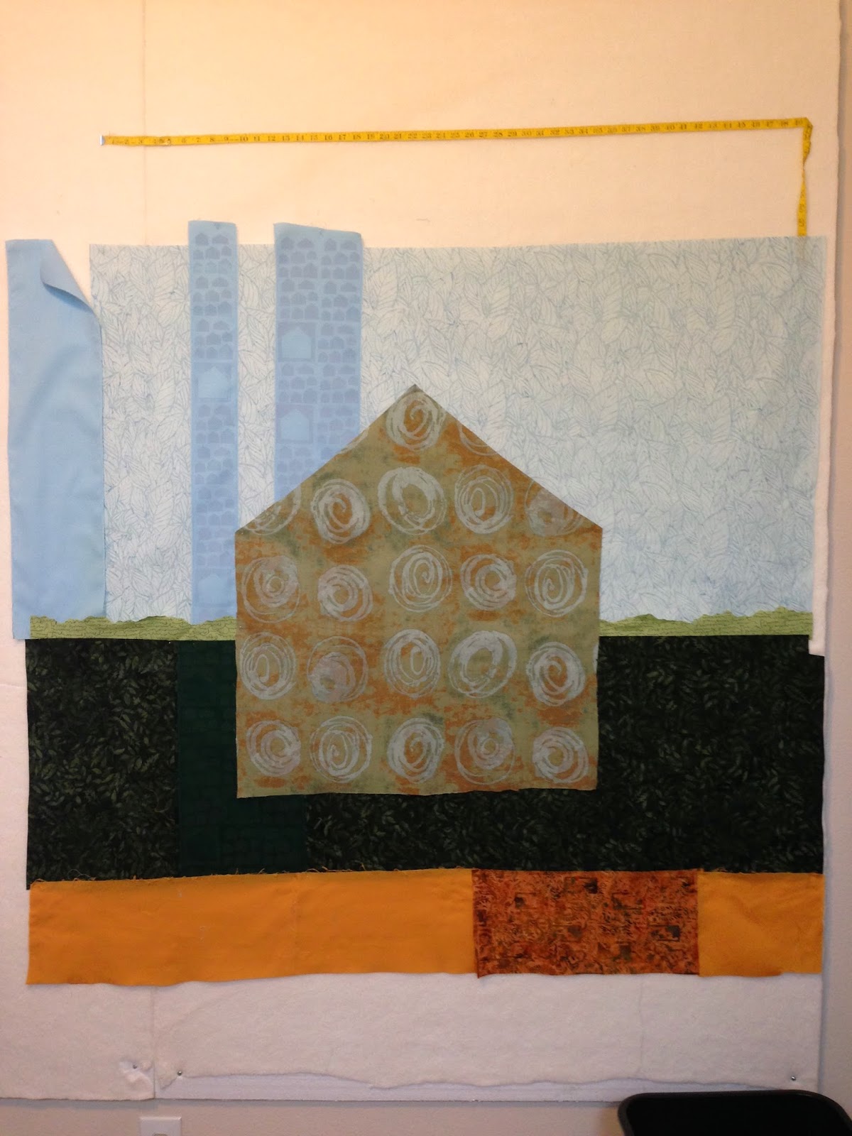
Many more alternations and configurations were considered. I'm sparing you the pictures. Eventually I settled on the composition and fused the blue to the green, then marked and cut out the space where the house would sit.
Then I repurposed some of the blue that had been cut away and used that to lengthen the whole blue area. (This meant I wouldn't have to use a third blue stamped solid strip. I wasn't in the mood to get the paint out again.)
You may also notice that I moved the green stamped fabric from the left side of the house to the right. Now the three vertical contrast sections (the blue stamped strips, the green stamped strip and the orangey print) are distributed more evenly across the composition.
So, now the whole thing is fused, except the yellow strip. I am planning some surface design in that section, so I want to be able to move that around freely.
There is a problem that needs to be addressed. The blue is misaligned a bit. The blue strips should be perpendicular to the horizon. The are a bit askew. Grumble.
It's so tricky to work this large. I am very accustomed to everything mostly fitting on my table and/or my ironing board. I've created several pieces in the 24x60 range, but the narrow width still lets me feel like I have a handle on it. This piece is big all over. I suppose artists who work this large on a regular basis develop techniques, tools and supplies that fit their needs.
I'm feeling like this quilt is going through a bit of an ugly stage. As I look at this picture, I see many areas that are problematic. Or maybe those are areas of potential. Many more layers of design will be added and I can envision them in my head, but there is still doubt.


2 comments:
Love seeing your thought process.
I go through this kind of angst on so many of my projects! Haha! good to know I'm not alone. When you make a large quilt, it's not just a matter of enlarging a small quilt, it's a different beast, all together. For example, a few sequins/beads or embroidery stitches would be perfect on a small quilt but lost on a large quilt. The scale of print in your fabric has a different impact in small vs large, etc. Just keep pressing on and it will turn out beautiful.
Post a Comment